A website that explains a complex product and leads to a trial
- UX and UI design
- Web development
- Copywriting
- Motion graphics
- Static and video visuals
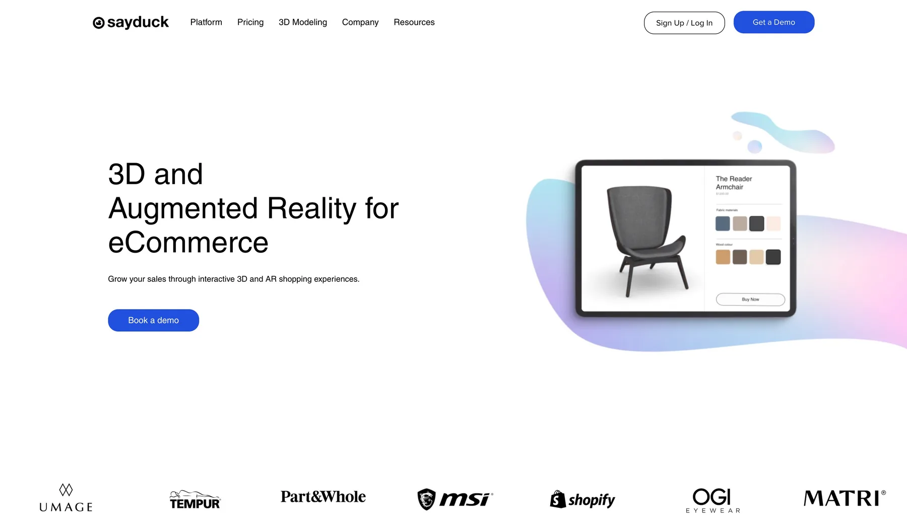
Sayduck's website had barely changed since the company's early days, while the company moved from selling to a few large accounts to winning self-serve customers. I rebuilt it end to end: the UX and UI, the build, every word of copy, and all the visuals and motion.
A site built for a different company
The old site was made when Sayduck was a startup and updated very little after that. It did not explain the product, it was slow, and it looked less professional than the brands Sayduck sold to.
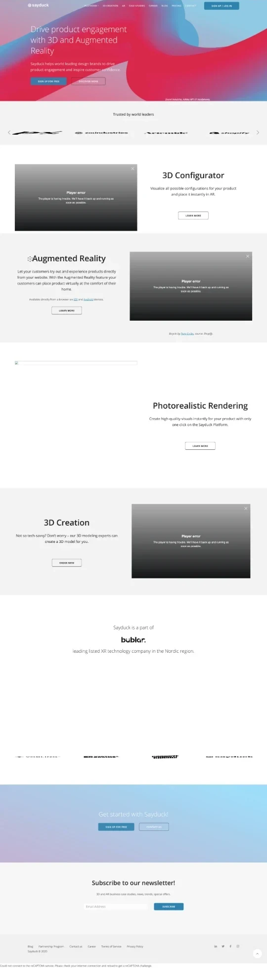
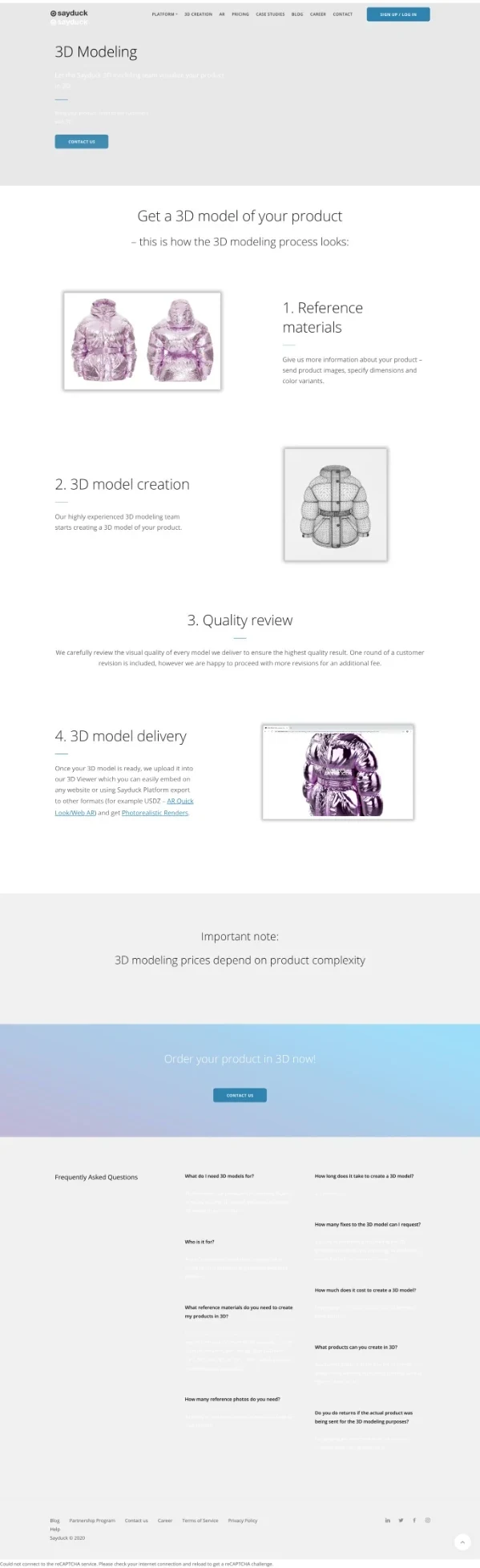
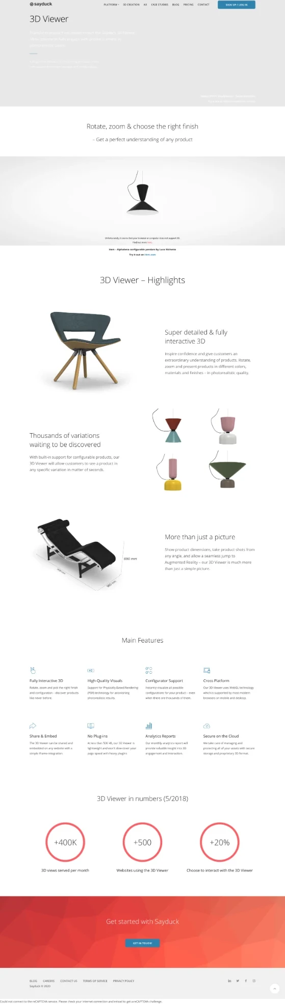
Sayduck was moving from selling to a few large accounts to winning self-serve customers. The site had to explain the product in seconds and end in a free trial.
Designed, written and built by one person
UX, UI, copy, visuals, motion and code were all done by me, so every decision was made together and nothing was lost in a hand-off.
One page for every question a buyer asks
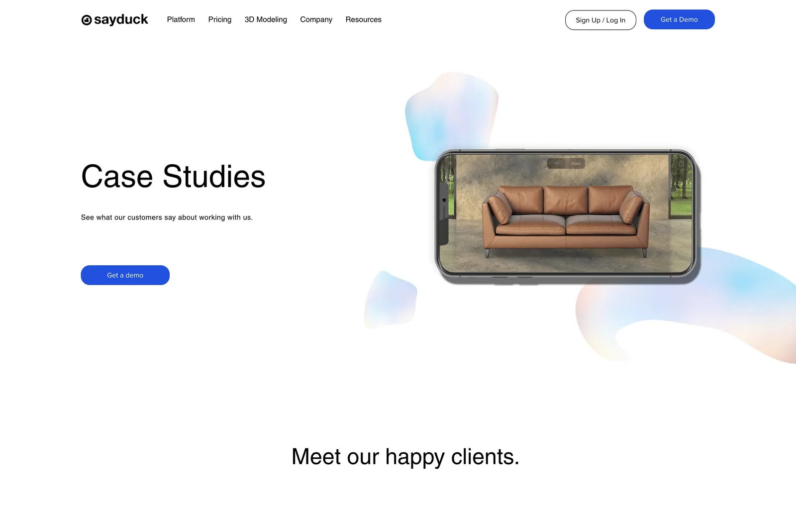
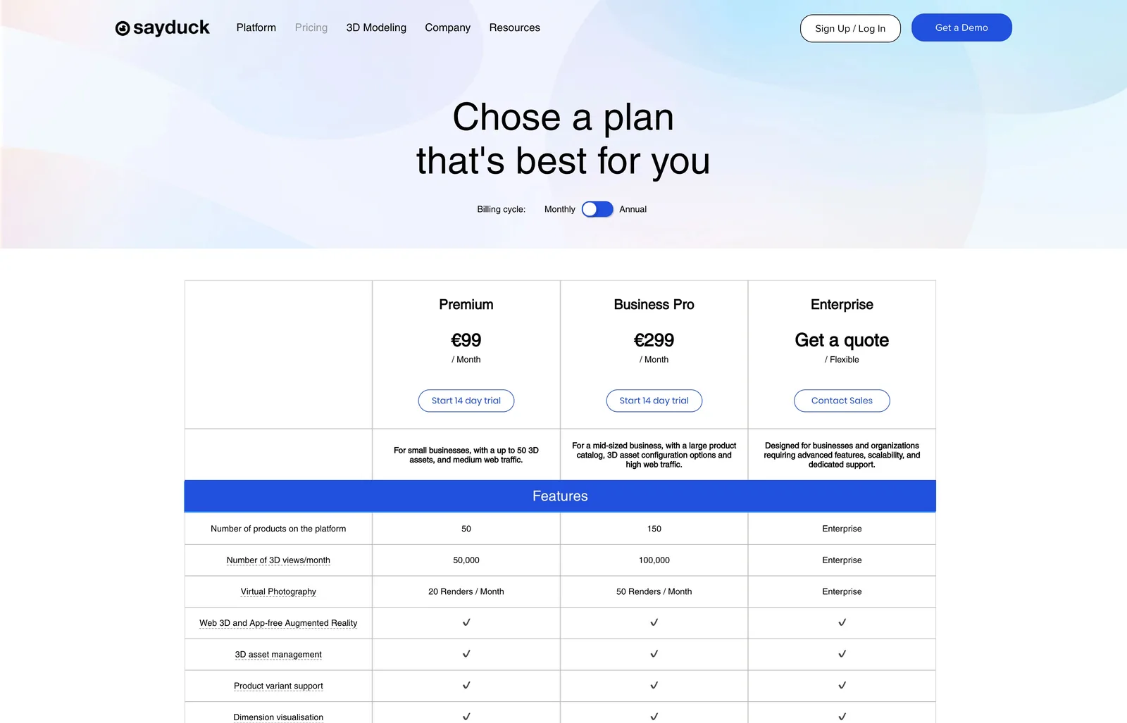
The home page sets out the product in one scroll. Each product and proof page answers one question, and every page ends in a way to start a trial or book a demo.

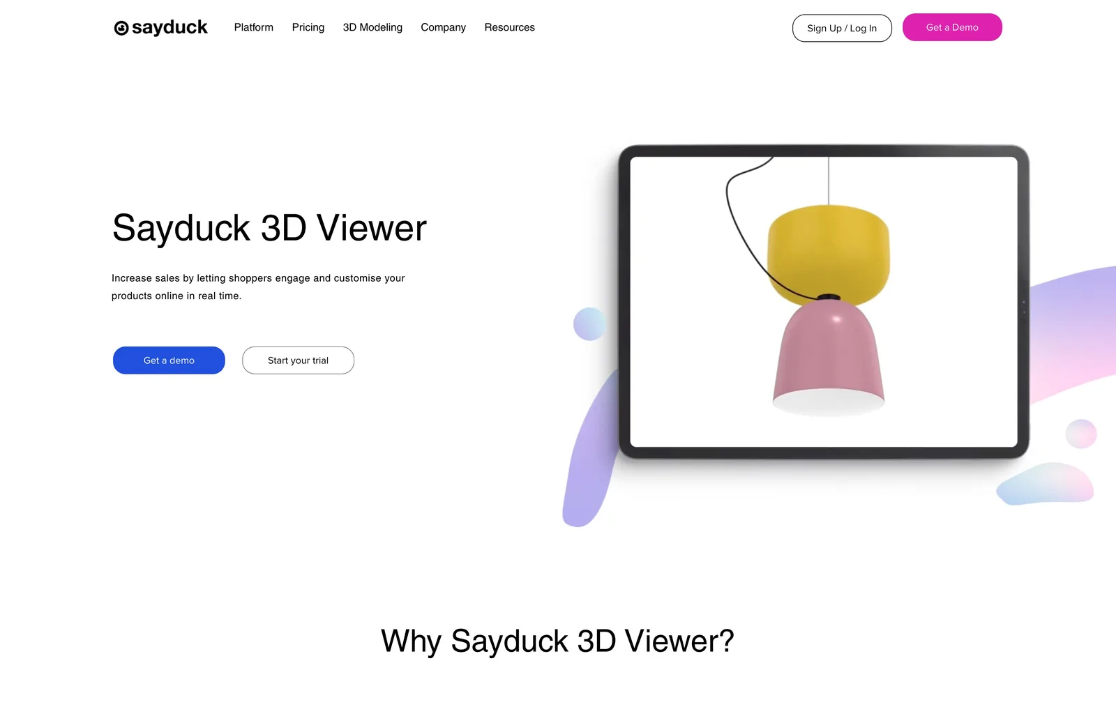
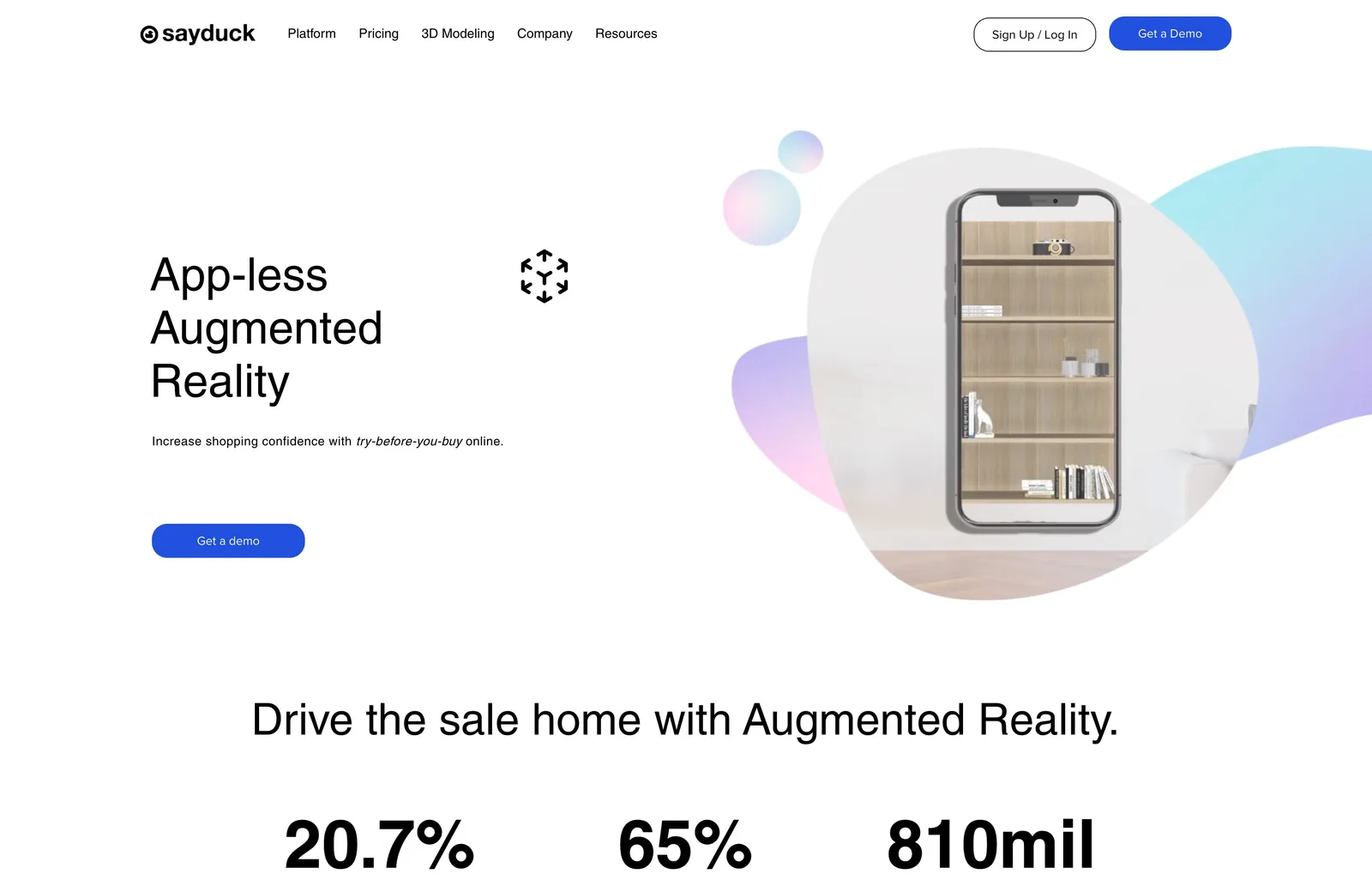
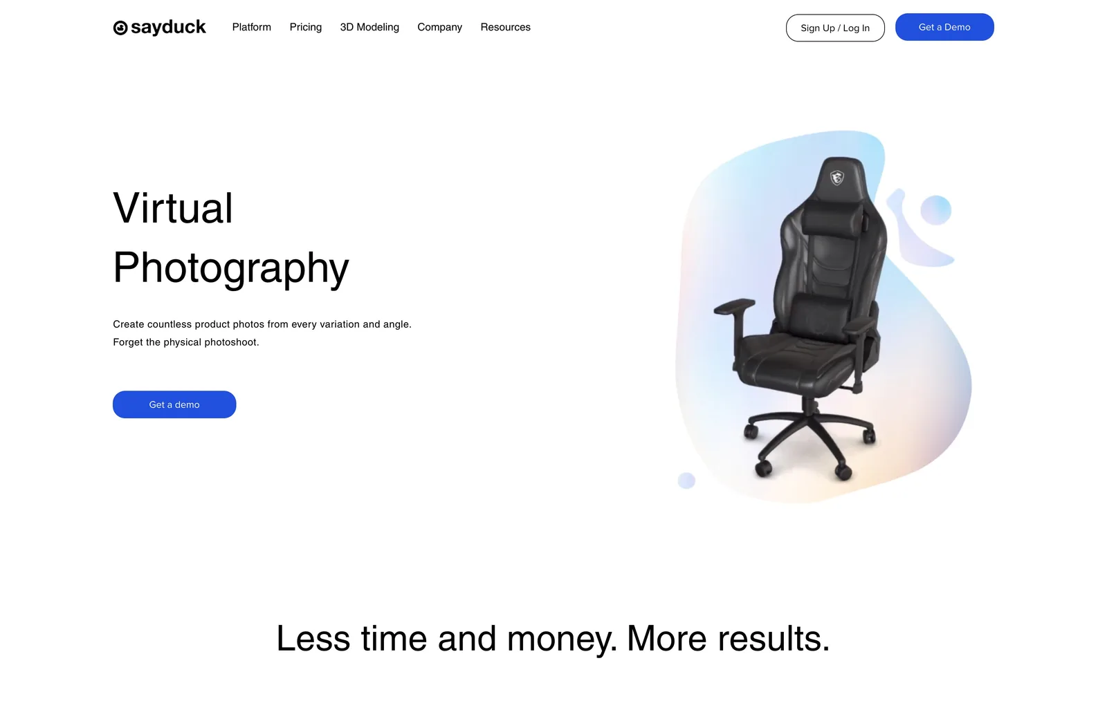
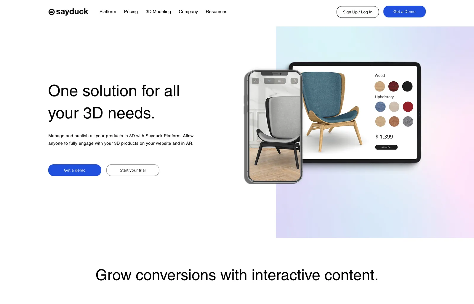
Motion that shows the product
Short loops on the home page and the product pages show the product at work: switching materials, placing a chair in a room in AR, turning a 3D model. I made each one myself.
A clear site, ready for self-serve
The new site launched in 2023 and is still live. These are the three things it was built to do.
One clear message
Every page opens on one plain sentence about what the product does for the buyer.
A path to the trial
A free trial and a demo on every page, and plans spelled out for self-serve buyers.
One visual language
Product visuals, device frames and soft gradient shapes tie every page together.
Need a website like this?
Visitors into demos: the whole funnel rebuilt
+50%Increase in returning visitorsAI B2B SaaS Scaleup / HelsinkiContent and site rebuilt to earn search authority
+32%domain authority (in just 3 months)