Get in touch

A website that explains a complex product and leads to a trial

ClientSayduck
Year2023
My roleDesign, UX, UI, web development, copy and all visuals
What I made
  • UX and UI design
  • Web development
  • Copywriting
  • Motion graphics
  • Static and video visuals
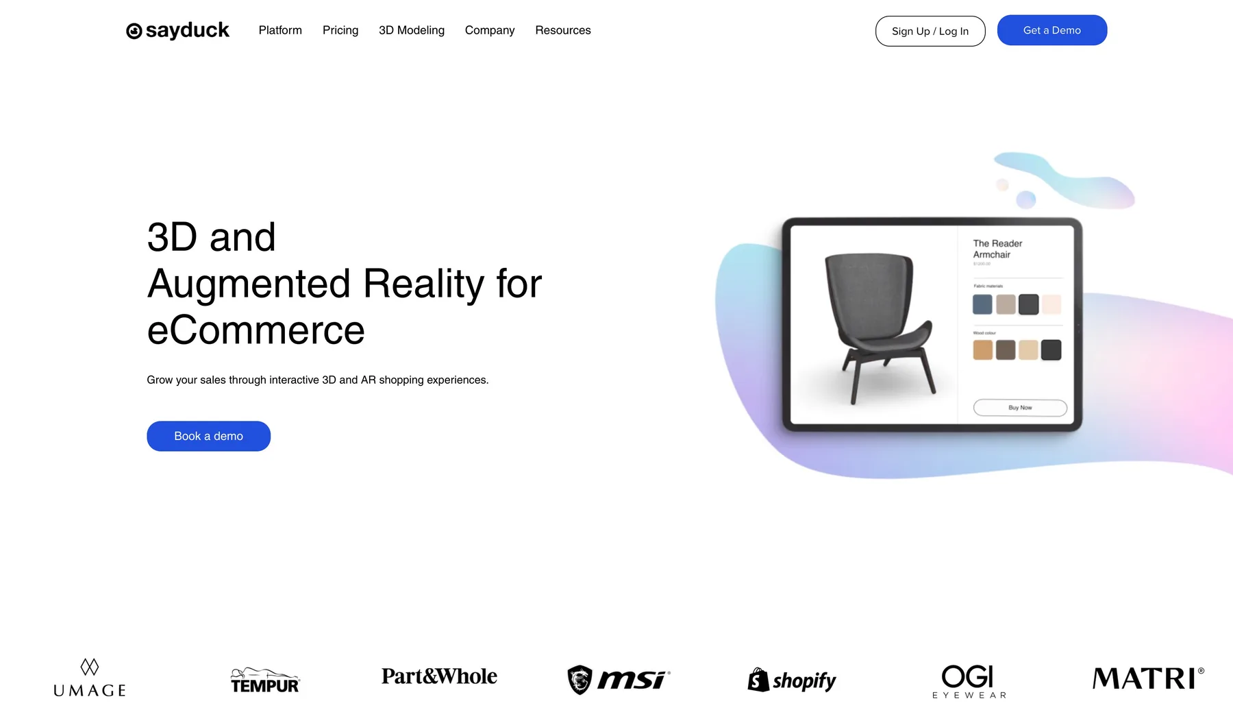
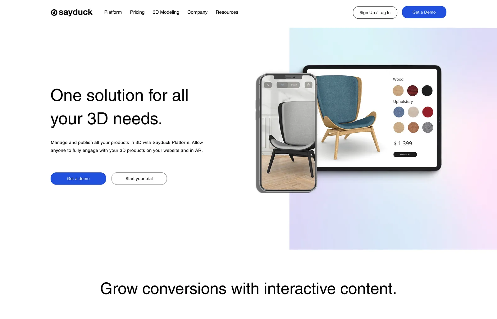
The Sayduck home page as designed and built

Sayduck's website had barely changed since the company's early days, while the company moved from selling to a few large accounts to winning self-serve customers. I rebuilt it end to end: the UX and UI, the build, every word of copy, and all the visuals and motion.

The problem

A site built for a different company

The old site was made when Sayduck was a startup and updated very little after that. It did not explain the product, it was slow, and it looked less professional than the brands Sayduck sold to.
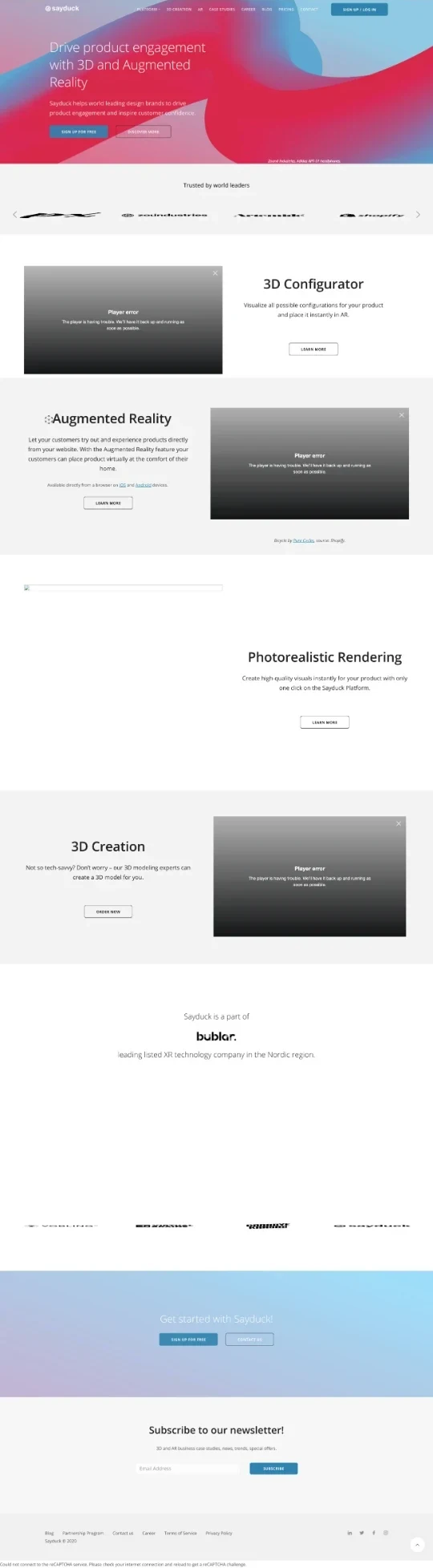
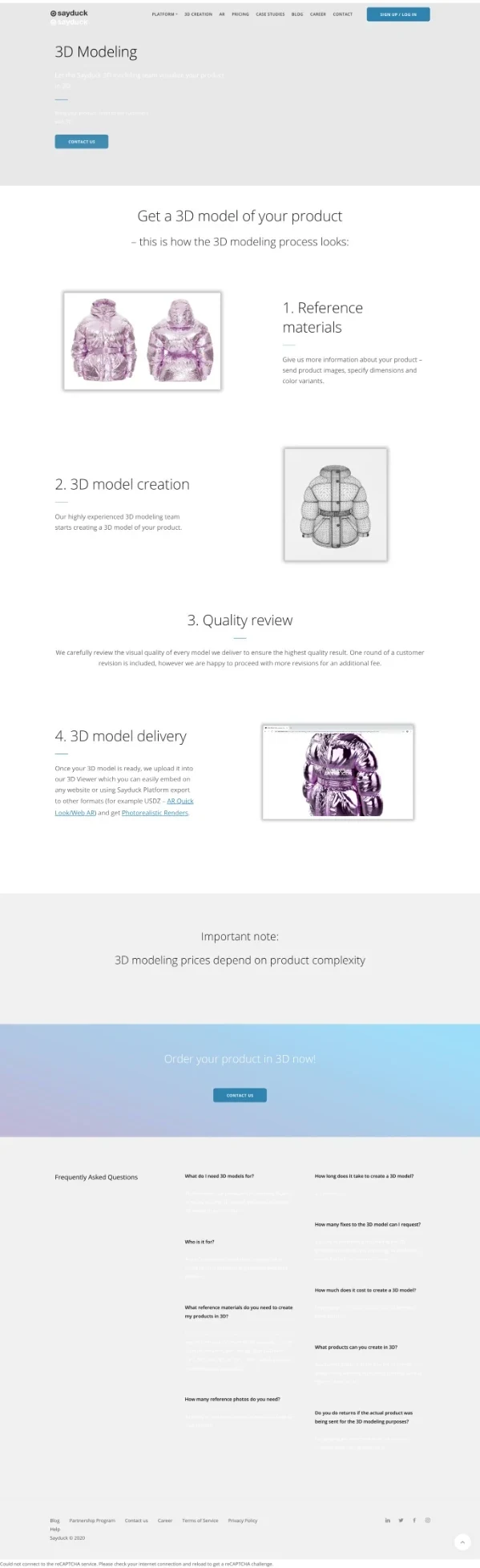
Home page. The hero was a 3D animation, which the web archive could not capture.
3D modeling page
3D modeling page
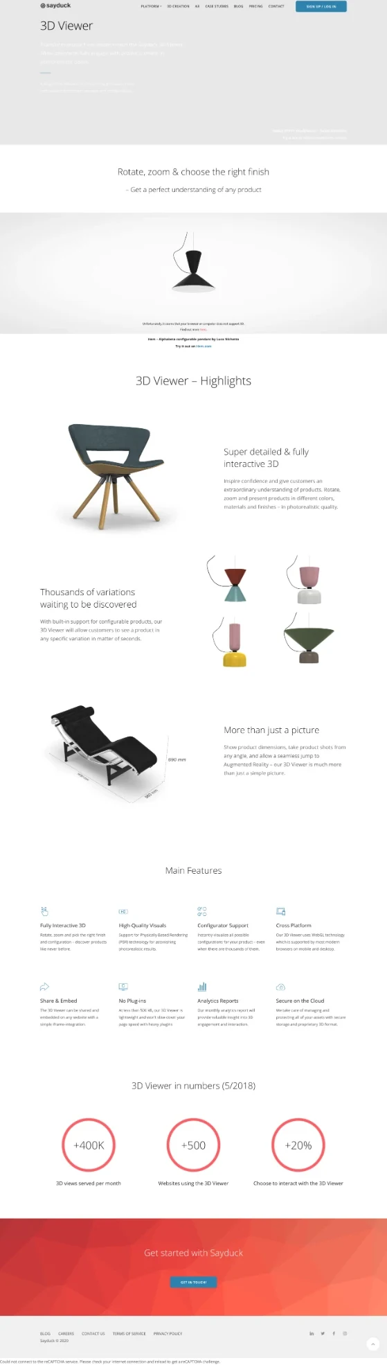
3D viewer page, still showing figures from 2018
Not convertingVisitors had no clear next step, so few of them became trials or demos.
Hard to understandThe copy listed features and never said what the product does for a buyer.
Out of dateOld figures and screens stayed on the page long after the product had moved on.
SlowHeavy pages lose visitors before they read a word.
Not professionalThe design looked dated next to the furniture and tech brands Sayduck worked with.
The goal

Sayduck was moving from selling to a few large accounts to winning self-serve customers. The site had to explain the product in seconds and end in a free trial.

The process

Designed, written and built by one person

UX, UI, copy, visuals, motion and code were all done by me, so every decision was made together and nothing was lost in a hand-off.

UX and UI designA light, uncluttered interface where the product is the hero: product visuals in device frames on soft gradient shapes.
CopyWritten for a buyer, in plain words that explain the product and what it does for them.
Visuals and motionAll the static visuals and videos, made to show the product in use.
Web developmentI built the site myself, so what I designed is what shipped.
The site

One page for every question a buyer asks

The home page sets out the product in one scroll. Each product and proof page answers one question, and every page ends in a way to start a trial or book a demo.

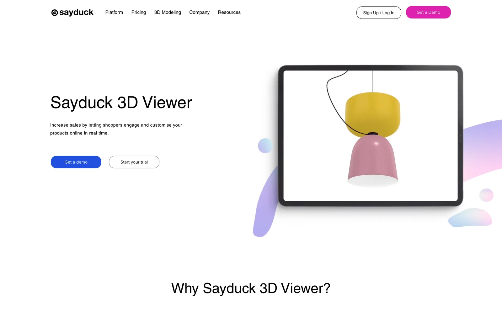
Scroll the whole home page
The home page: what Sayduck does, the platform in three parts, proof from customers, and a path to a trial.
3D Viewer page
3D ViewerShows the product the way a shopper uses it: rotate it, change the finish, zoom in.
Augmented reality page
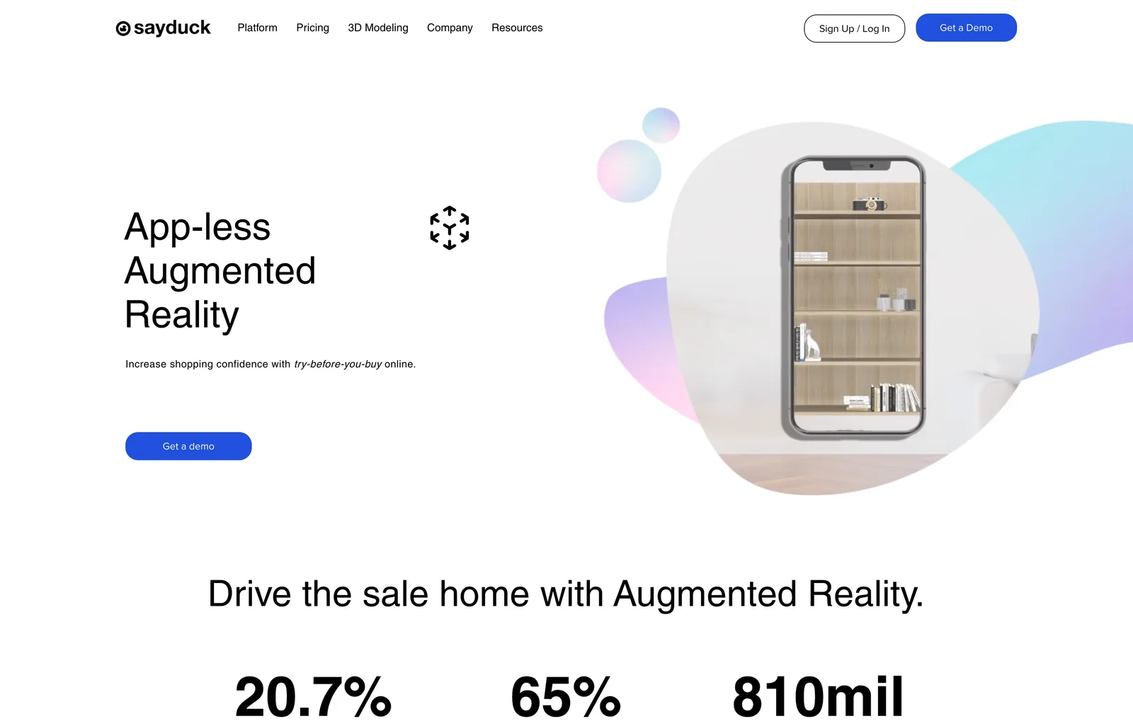
Augmented realityApp-less AR explained in one scroll: scan, place the product in your room, and decide.
Virtual photography page
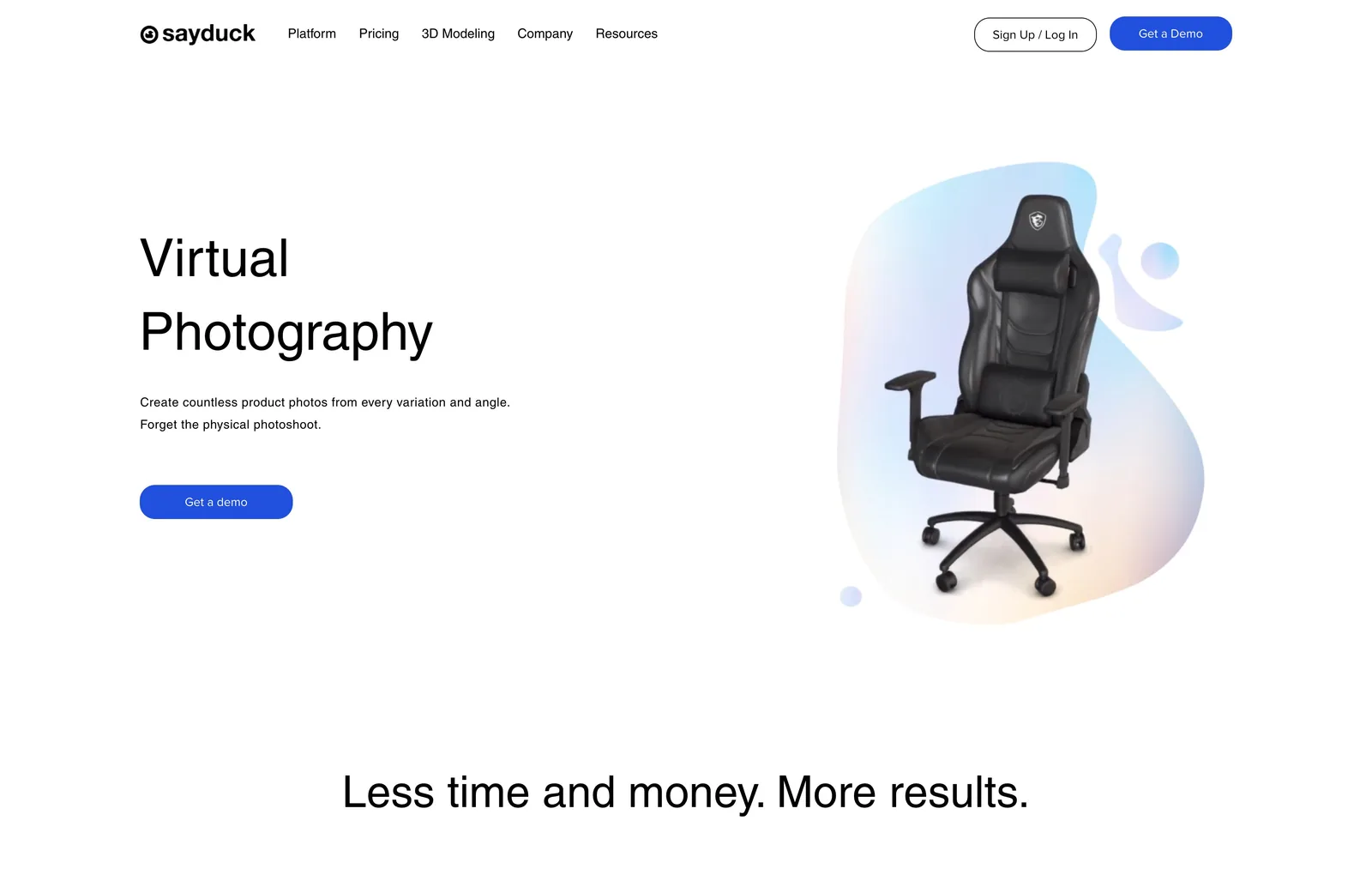
Virtual photographyMakes the case against slow, costly photo shoots with product images made from the 3D model.
Platform page
PlatformOne page for buyers who want the whole picture: how it works in three steps, and everything it does.
Case studies page
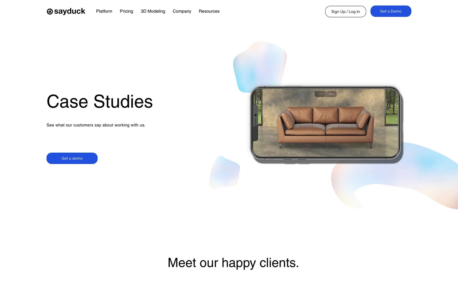
Case studiesCustomer stories sorted by industry, with logos at the top as quick proof.
Pricing page
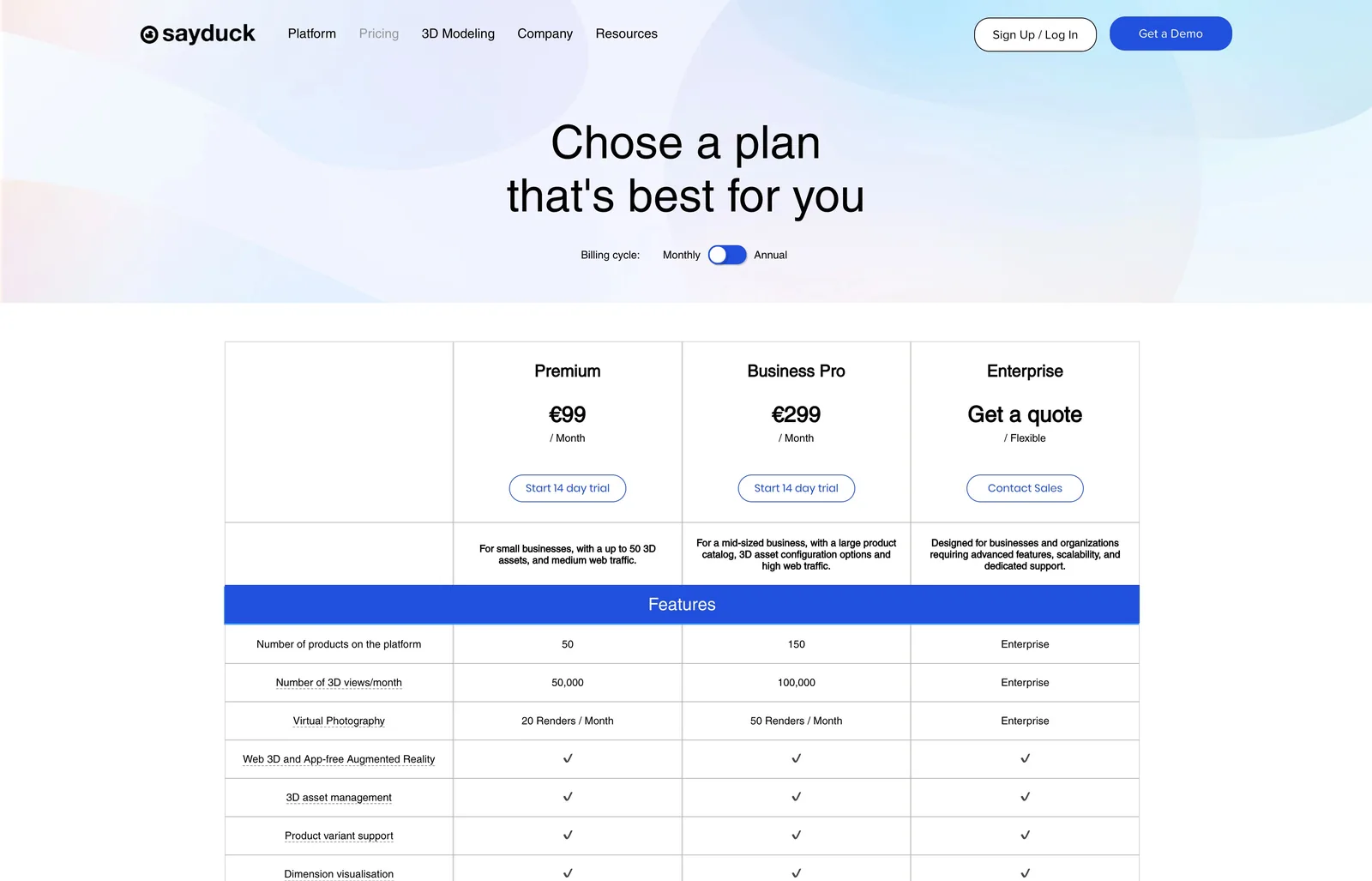
PricingPlans laid out so a self-serve buyer can choose without talking to sales.
Visuals and motion

Motion that shows the product

Short loops on the home page and the product pages show the product at work: switching materials, placing a chair in a room in AR, turning a 3D model. I made each one myself.

Home page hero. An armchair on a tablet, changing fabric and wood finish.
3D configurator. A pendant lamp changing colour on a tablet.
Platform page. Configuring the seat, back and legs of a chair.
Material and mesh variations on a sofa, changed live in the platform.
Virtual photography. Setting up a product shot inside the platform.
Augmented reality with a variant picker: change the upholstery and legs of the chair in your own room.
Augmented reality on a phone: a sideboard placed in a real room.
3D modeling page. A product model turning on a soft gradient shape.
The outcome

A clear site, ready for self-serve

The new site launched in 2023 and is still live. These are the three things it was built to do.

01

One clear message

Every page opens on one plain sentence about what the product does for the buyer.

02

A path to the trial

A free trial and a demo on every page, and plans spelled out for self-serve buyers.

03

One visual language

Product visuals, device frames and soft gradient shapes tie every page together.